Branding Design 101
How to build a premium brand identity that works as hard as you do
Your brand isn’t just “how it looks.”
It’s the shorthand for how people feel about you before you ever meet in person, hit “send,” or launch that next offer. A premium brand is an ecosystem—every visual, every word, every touchpoint quietly signaling you belong here.
Here’s what goes into a luxury-level identity, straight from the playbook of a Creative Director with 18 years of experience in an advertising agency.
The Logo Mark:
More Than a Signature
The right logo mark doesn’t just identify, it aligns.
Clean, balanced, timeless: designed to live beautifully on your homepage, in printed collateral, and a tiny Instagram profile image.
Multiple variations: horizontal, vertical, icon-only—each refined intentionally, never improvised.
Not literal: your mark doesn’t need to “explain” your business. It’s a symbol that is memorable and builds a feeling, not an illustration.
yup, that’s my logo suite
Typography:
The Architecture of Your Voice
Fonts speak—often before the words themselves.
Choose at least two: one for headlines, one for body copy
Finesse the details: kerning, leading, tracking
Consider numerals and punctuation: yes, they matter more than you think
Premium typography is invisible when done right, but glaring when it’s off.

Elements of Typographic Style by Robert Bringhurst ©sanjitbakshi
Color Palette:
The Emotional Undercurrent
Color is context. It’s mood. It’s memory.
A full spectrum: light + dark + midtones for flexibility
Neutrals to ground the palette
Metallics for just enough shimmer
Consider one bold signature hue: your visual calling card (think Tiffany blue or Hermès orange)
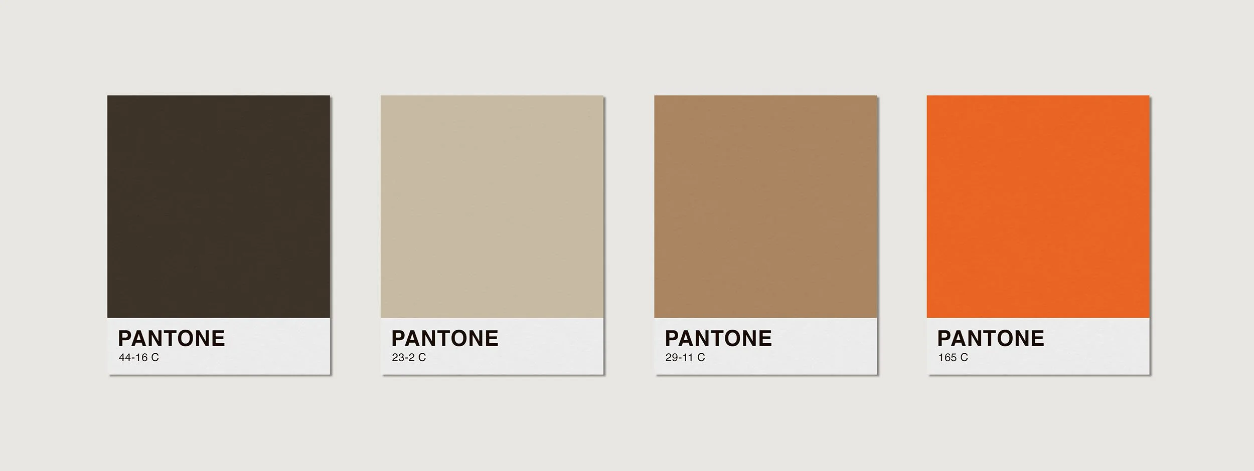
color palette with pantone swatches
Tone of Voice:
Your Brand’s Inner Dialogue
Visuals get attention. Words keep it.
Sophisticated yet accessible—your audience should feel seen, and drawn in by your brand’s personality
Consistency in cadence, vocabulary, and perspective
Adaptable by platform without losing your center of gravity
Tip: Your voice should answer the silent question every client asks: “Do they get me?”
Consistency: The Quiet Power Move
The most premium brands don’t reinvent their style every season—they deepen it.
Keep your brand colors, typography, and logo treatments tight
Align your messaging across all touchpoints
Refine often, overhaul rarely
Key Takeaways
Premium branding is clarity + cohesion, not clutter
Details (spacing, tone, palette) do heavy lifting
Consistency is not boring—it’s trust-building
Every decision should reinforce your “onlyness factor”
Your Next Step
If your brand feels almost there but not effortlessly there, that’s your cue. 📩 Let’s create a brand identity and website that do more than look pretty—they work for you. To see more work, please check out my portfolio